 Soyun
Pocket Saju
Pocket Saju is an AI-powered Korean Saju reading app for Gen Z and millennial women and LGBTQ+ users in North America. It replaces vague, patriarchal readings with expert-backed, inclusive, and playful guidance.
About the name: “Pocket” means a Saju consultation you can pull out of your pocket anytime. It also refers to the lucky pouch (bokjumeoni), a Korean symbol for holding good fortune.
- Role
- Design Engineer
- Team
- Solo
- Timeline
- Sep 2026 – Present
- Platform
- iOS & Android (React Native)
Impact
Context
Saju is in demand, but no app is built for the people who want it
Who uses it
No global survey on Saju exists, so I looked at the closely related astrology market (Pew Research, 2025):
- 37% of Gen Z and 32% of millennials consult astrology at least once a year, compared with 20% of adults 65+.
- Women and LGBTQ+ people use astrology at more than twice the rate of men. Among daily users, the gap is sharper: 1% of men, 2% of women, and 3% of LGBTQ+ adults.
Based on this, I defined the core users as Gen Z and millennial women and LGBTQ+ people.
What’s broken
Demand is growing in North America, but no Korean Saju service has been built around these users. I analyzed 80+ competitor app reviews and 50+ Reddit comments on Saju posts and found four gaps:
- Shallow, unexplained readings. Apps lack real Saju expertise. They skip advanced theory and exceptions, give vague, overly positive answers (the Barnum effect), and rarely explain how they reached a conclusion.
- Outdated gender norms. Traditional Saju is patriarchal. A match where the woman sacrifices for the man is still called “good compatibility.” Gender input is binary and assumes a heterosexual relationship, which shuts out LGBTQ+ users.
- Unstable service, no feedback loop. Frequent bugs hurt trust, and there’s no structured way to collect feedback and improve reading quality.
- Dull, mismatched UX. Most users use these apps for entertainment, but the apps lean on heavy, mystical imagery: spirits, cranes, and ink paintings.
Solution
Start from a sharply defined user
The difference isn’t a single feature. Every decision, from how readings are written to the gender options to the character, came from a data-driven definition of who the users are. Competitors’ male-centered readings and stiff look and feel came from never defining their users clearly. In Pocket Saju, both the planning and the design are built around these users.
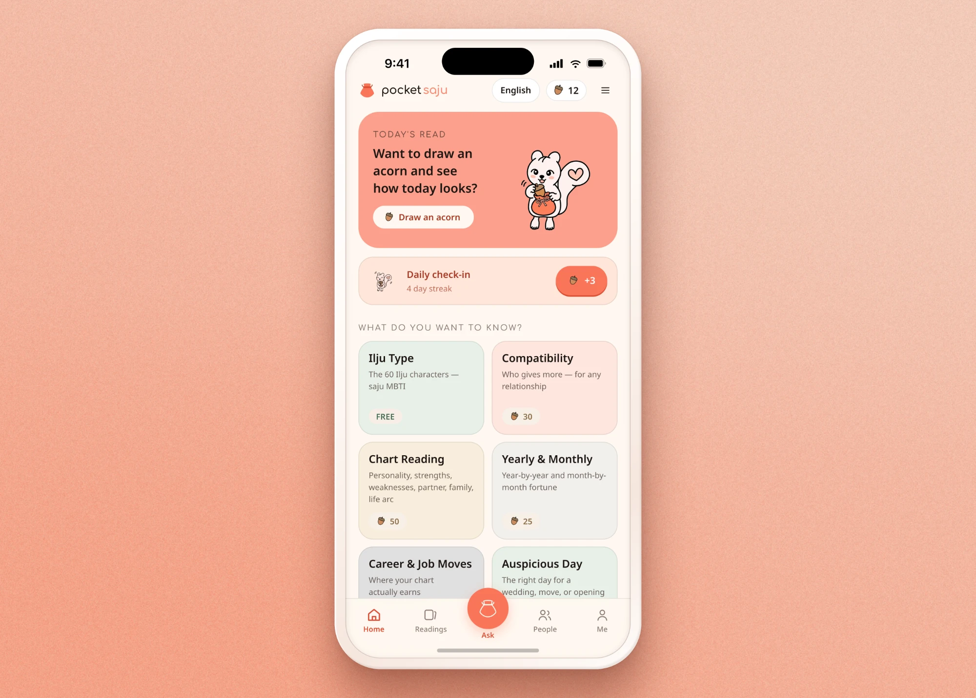
Users can get a reading as a full report or ask follow-up questions in a chat with the mascot.
Four differentiators
- AI built on real Saju expertise. Interpretation rules come from my Saju knowledge and two years of consultation experience. The AI reads the whole chart (year, month, day, and hour pillars) and the interactions between the five elements, not just the day pillar. It names weaknesses and hard periods openly, pairs them with concrete advice, and shows the reasoning behind each conclusion.
- Modern, LGBTQ+-inclusive design. A match counts as good only if it’s good for both people. Gender isn’t forced into a binary. Areas of Saju that don’t depend on gender use one shared standard. Where traditional theory differs by gender, users choose a masculine or feminine chart calculation, set separately from their pronouns, and the app explains the difference first. Example: “This match works well for him, but it’s a disappointing one from her side.”
- Stable service, continuous improvement. A real-time dashboard tracks app errors and user reports, so high-impact bugs get fixed first. Users who hit an error or a weak reading can report it through an in-app support chatbot and receive acorns (in-app currency) back after review. Feedback on clarity, relevance, and usefulness feeds back into the interpretation rules and prompts.
- Fun, engaging UX. A bright, light interface with a cute but blunt squirrel guide. Payment becomes play: the squirrel is “too hungry to read your fortune” until you feed it acorns. A daily lucky draw cracks an acorn open like a fortune cookie to reveal today’s reading.
Features
Five features, built around the users
Each feature turns one of the differentiators above into a screen you can try.
This is the working app, not a recording. Choose a feature to jump to its screen, then keep exploring. Nothing is charged and nothing leaves your browser.
Design system
Cute but blunt, warm, and consistent
Mascot: Daram the squirrel
Saju combines 12 animals and 10 natural elements into 60 character types. My own type is the squirrel, so Daram is my voice. The readings reflect my perspective and are reviewed by me. A squirrel’s habit of gathering acorns, paired with the lucky pouch, became the product’s story: users give acorns that fill the pouch (top-up and feeding), and acorns come out of the pouch as daily fortunes (lucky draw).
Personality: cute but blunt
Daram says no when the answer is no, honestly and without sugarcoating, like a close older sister giving advice. This answers the vague, flattering readings of other apps. The cute look reflects what the target users enjoy and softens the honesty. Daram has nine emotional states (guide, happy, excited, love, hungry, generous, scold, eating, celebrate), used in place of emojis.
Color: warm pastels
A cream background with one accent, coral, reserved for actions: one coral action per screen. Acorn brown and muted five-element colors add warmth, so tradition shows through texture rather than as a theme. Dark surfaces stay warm coral-brown. Mystical purples and blue-greys are banned, a deliberate break from competitors.
Typography
The logo and English titles use Comfortaa, which is round, soft, and friendly. Its curves stand out most in lowercase, so the wordmark is set as “pocket saju.” Body text uses Noto Sans for readability, Korean uses Noto Sans KR, and Hanja pillars use Instrument Serif.
Brand rules
The pouch is the logo and the acorn is the currency. Their roles never swap.
Tokens
4px spacing, a rounded radius scale, and no blurred shadows. Every value is a named token used identically in design and code, which keeps the two from drifting apart.
Design to build
From research to a working app in two weeks
- Research (2 days): Pew Research data, 80+ competitor reviews, 50+ Reddit comments.
- Design system and character (1 day): color and type tokens, Daram.
- Screen design (5 days): designed in Claude Design.
- Build (1 day): implemented in React Native with Claude Code and GitHub.
- Test and iterate (remaining time): tested the app and refined it.
Most of the time went into design. Because the design system was defined as tokens up front, design and code stayed in sync, and the build took just one day.
Reflection
What I learned
A sharp user definition makes every decision easier
Defining the core users with data guided every choice in planning and design, from reading tone to gender options to the character.
[Lesson two]
[A few sentences on what you learned.]
[Lesson three]
[A few sentences on what you learned.]